The people's opera house
People’s perception of Folkoperan is largely shaped by the plays they put on, and less by their reason to be – to make opera more accessible to everyone, regardless of age and background. This was the reason for a new design programme.
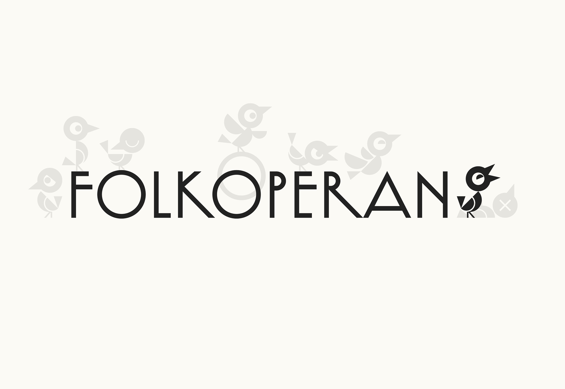
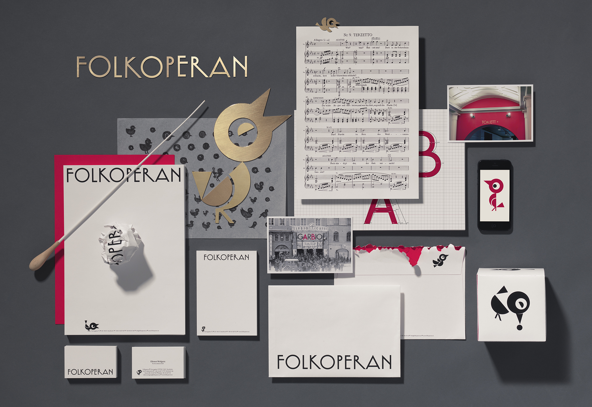
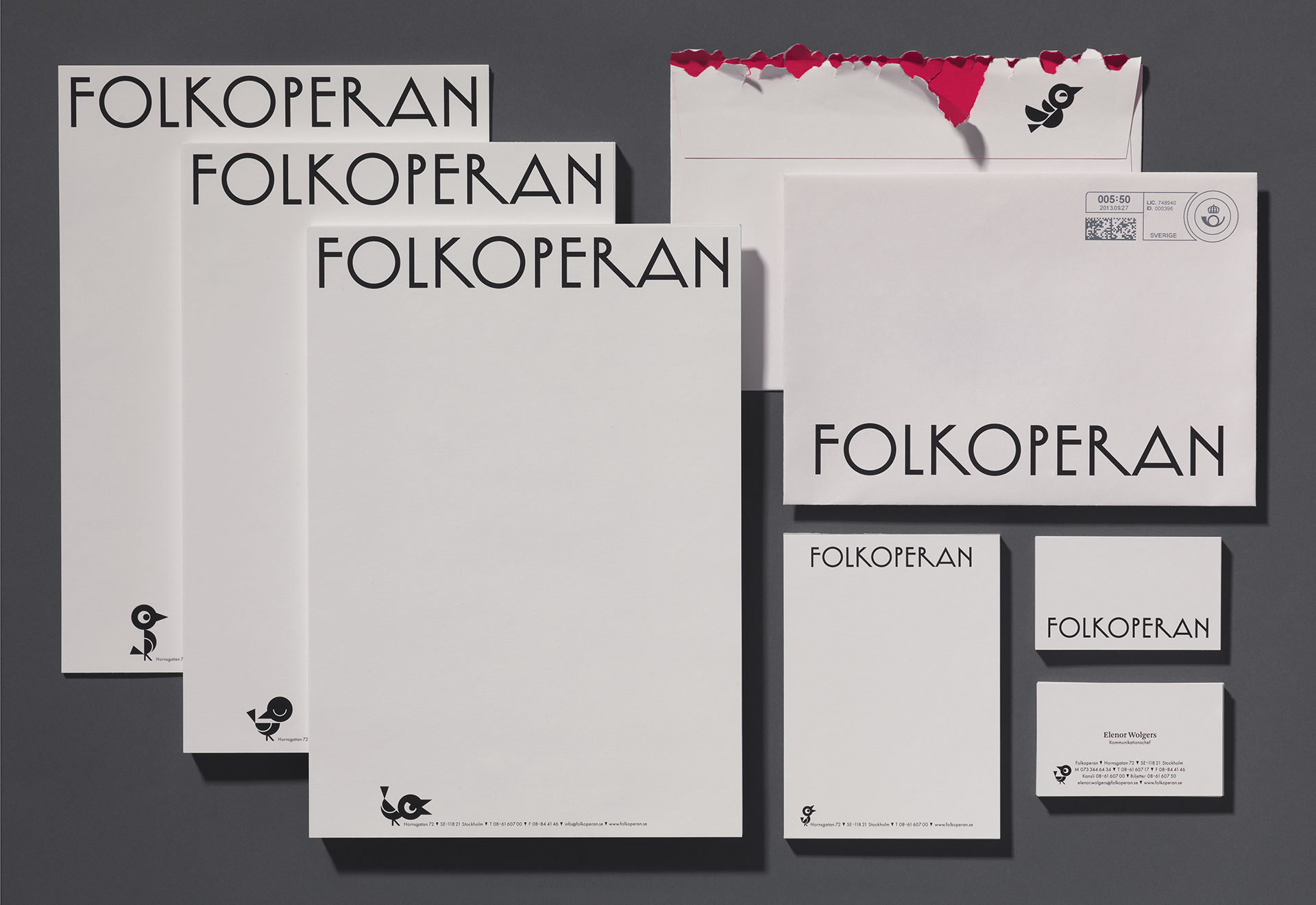
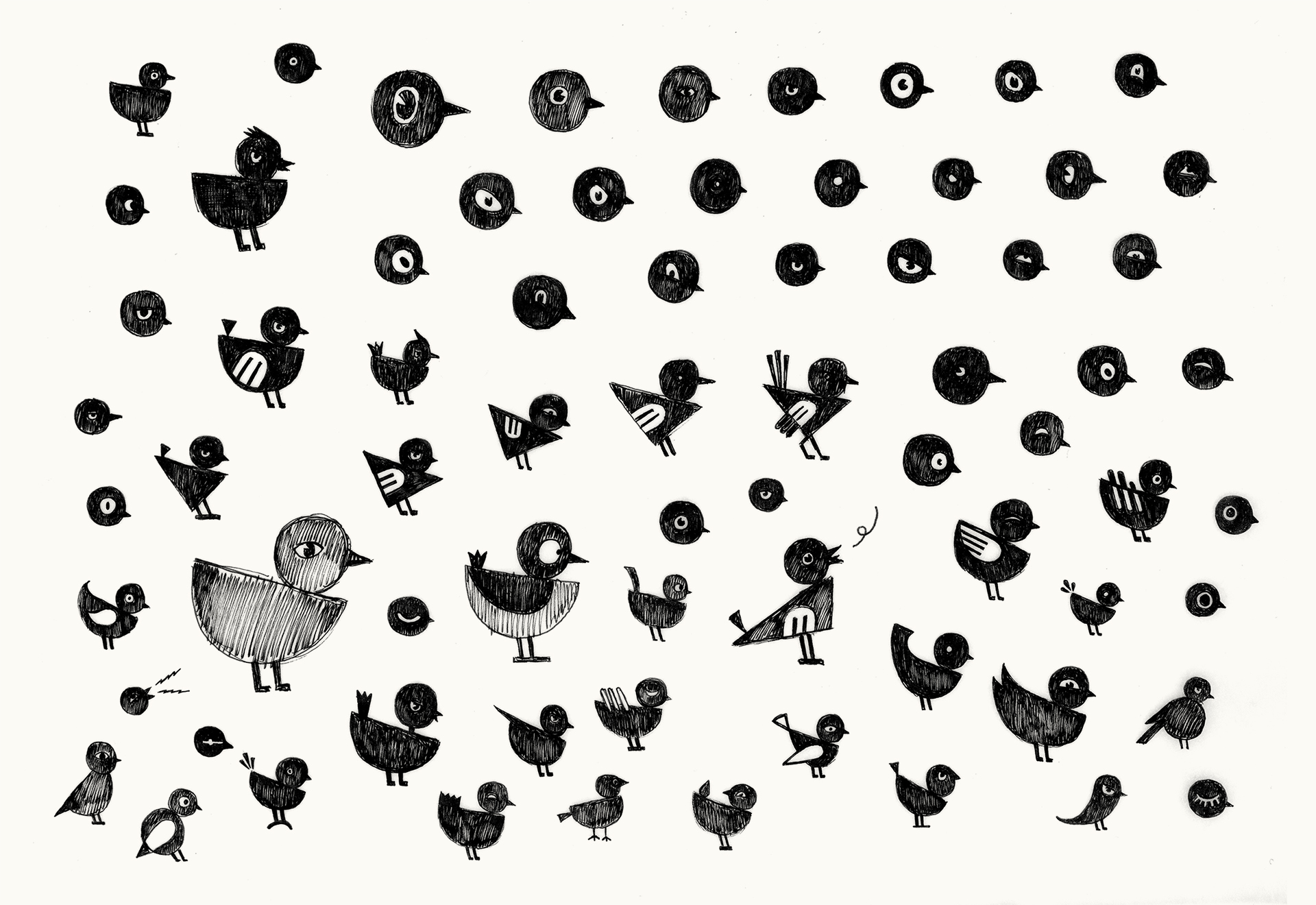
We felt there was a need for a flexible identity and a songbird became the answer. This playful metaphor reflects different moods, is flexible to use and interacts with the logotype depending on the message or use. Our symbol flies, sits and sings. Sometimes he’s happy, sometimes mischievous, angry and sometimes sad. Everything depends on the performance and the context. The bird itself is also made up from typographic elements based on strict geometric shapes of the logotype’s early 20th century inspired forms. Altogether, bringing Folkoperan’s history to life in a playful way.


The Art Deco inspired Opera house building has a rich history and is home to Folkoperan and the brand. The building’s original 1930’s signage, ‘GARBIO’ was our starting point for the new identity and signage system. We took inspiration from the sans-serif letterforms of the ‘A, B, G, R , Å and Ä’ and applied them to a more modern cut of Futura.


The building’s colourful red interior is carried through in our colour palette, stationery and packaging.