Jägermeister Typeface
Meister is a new typeface for Jägermeister’s global communication. The custom typeface gives the brand a unique voice in all media channels. The bold geometric shapes of the Bauhaus have served as an inspiration for the design, a reflection of Jägermeister’s German origins.
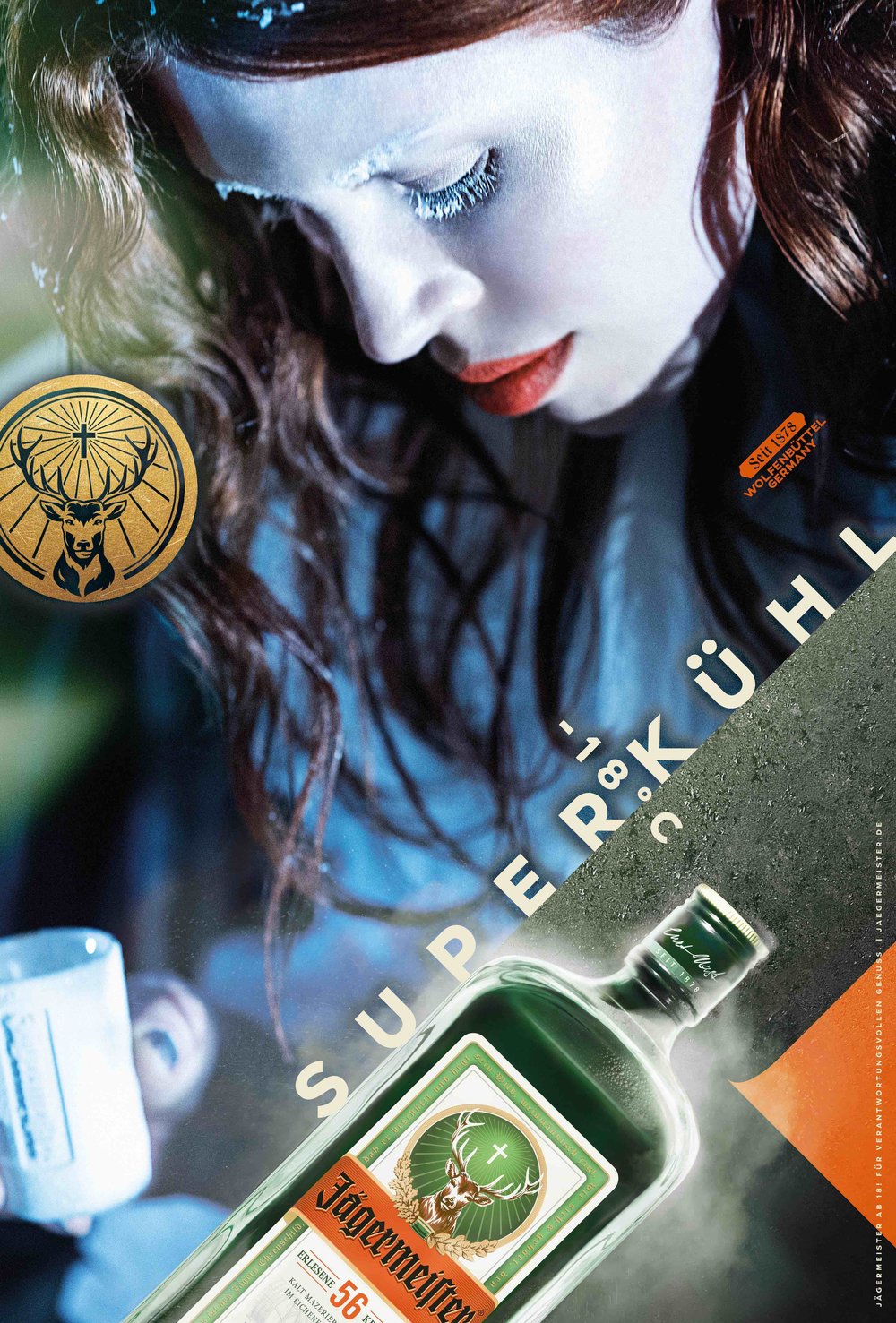
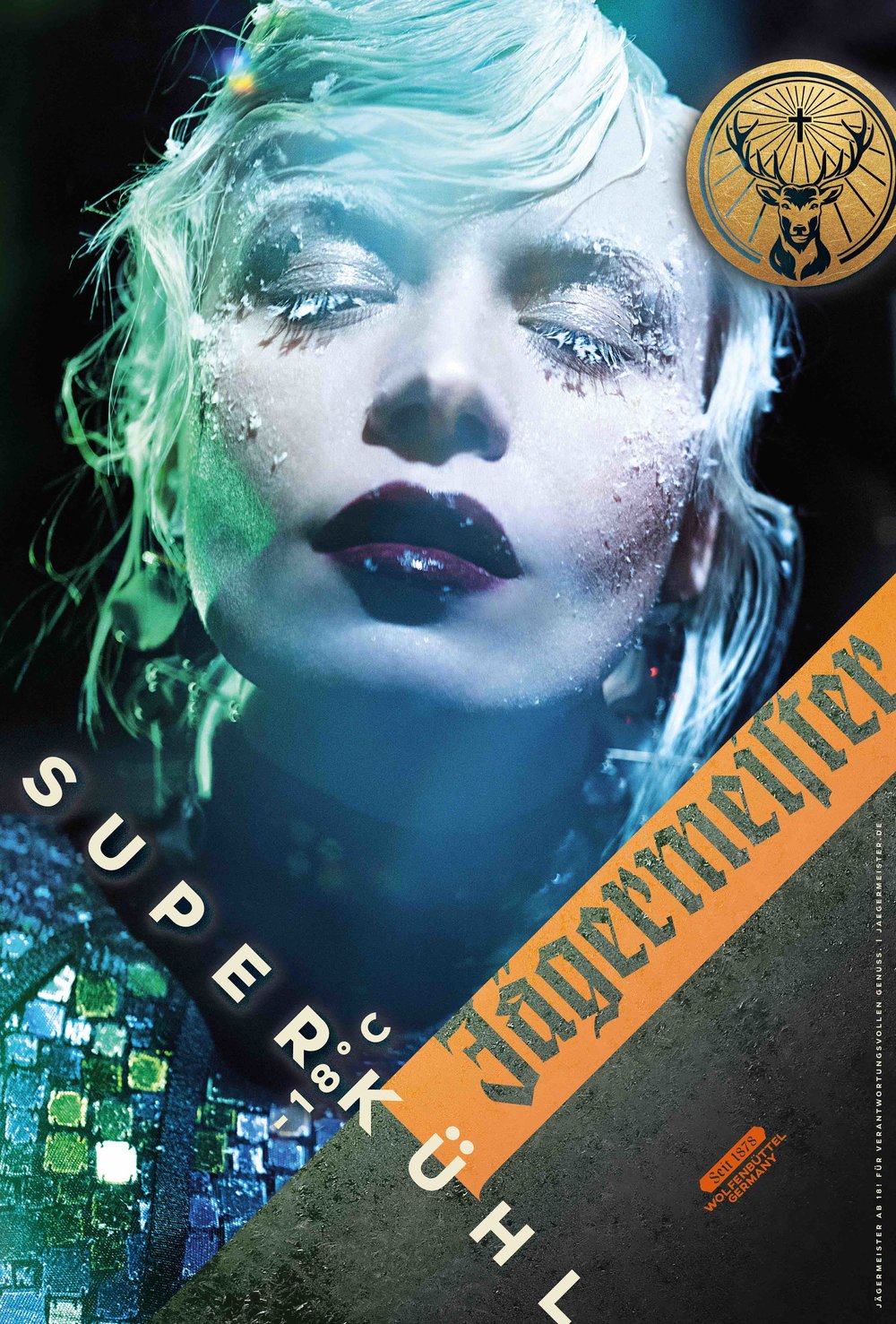
There are three key design features that make Meister typeface unique: the 45° angle cuts and diagonal strokes, the flattened curves, and the blocky appearance.
The typeface fits perfectly in the dynamic design of Jägermeister’s campaign, where the 45° typesetting is an important feature. Letters like K and R have 45° angle diagonals and the terminal ends of characters like C and S are cut at that same angle. This provides stability when the text is rotated. The flattened curves of the letterforms reference Jägermeister’s iconic bottle shape.
The proportions of the uppercase letters in the typeface are closer to a square than a rectangle, giving it a distinct blocky appearance. The character set includes diacritic alternates to help maintain a solid blocky shape in different languages. NM type have also introduced ‘twin’ ligatures, which melt two identical letters into a unique shape. These new letterforms give Jägermeister a exclusive and modern design expression.
The typeface is part of Jägermeister’s new global identity and advertising campaign, marking the first major rebrand in its history. The creative platform by ad agency Opperman Weiss ‘Be the Meister’ is currently being rolled out worldwide in TVC, print and web.
→ Article on Eye on Design