Quality takes no shortcuts
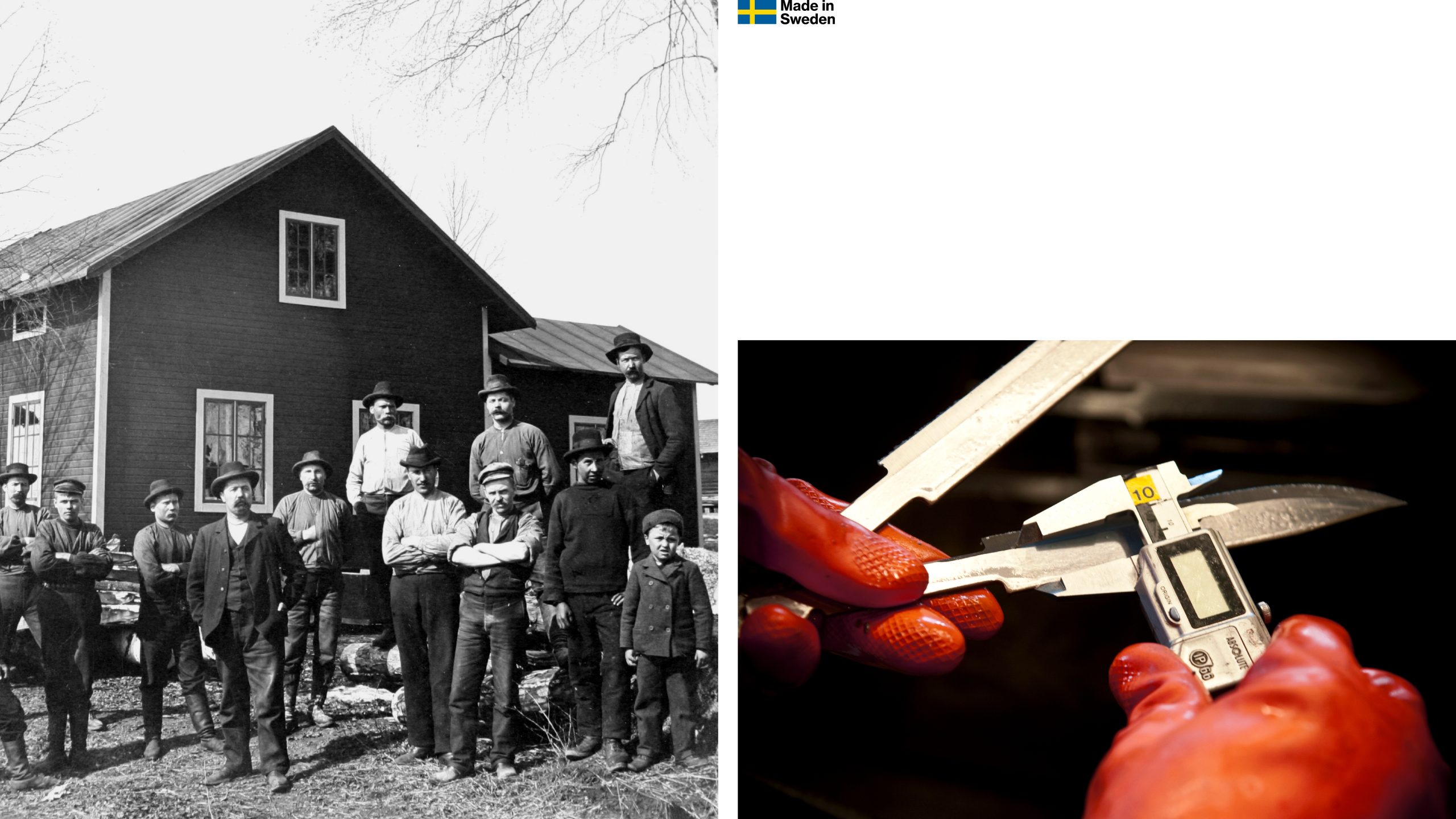
Morakniv has a proud heritage of making high quality knives. In crafting the brand concept, visual identity, typography and the packaging design we were inspired by the craftmanship of Morakniv’s 130 year history and their never-ending ambition to make things everlasting.
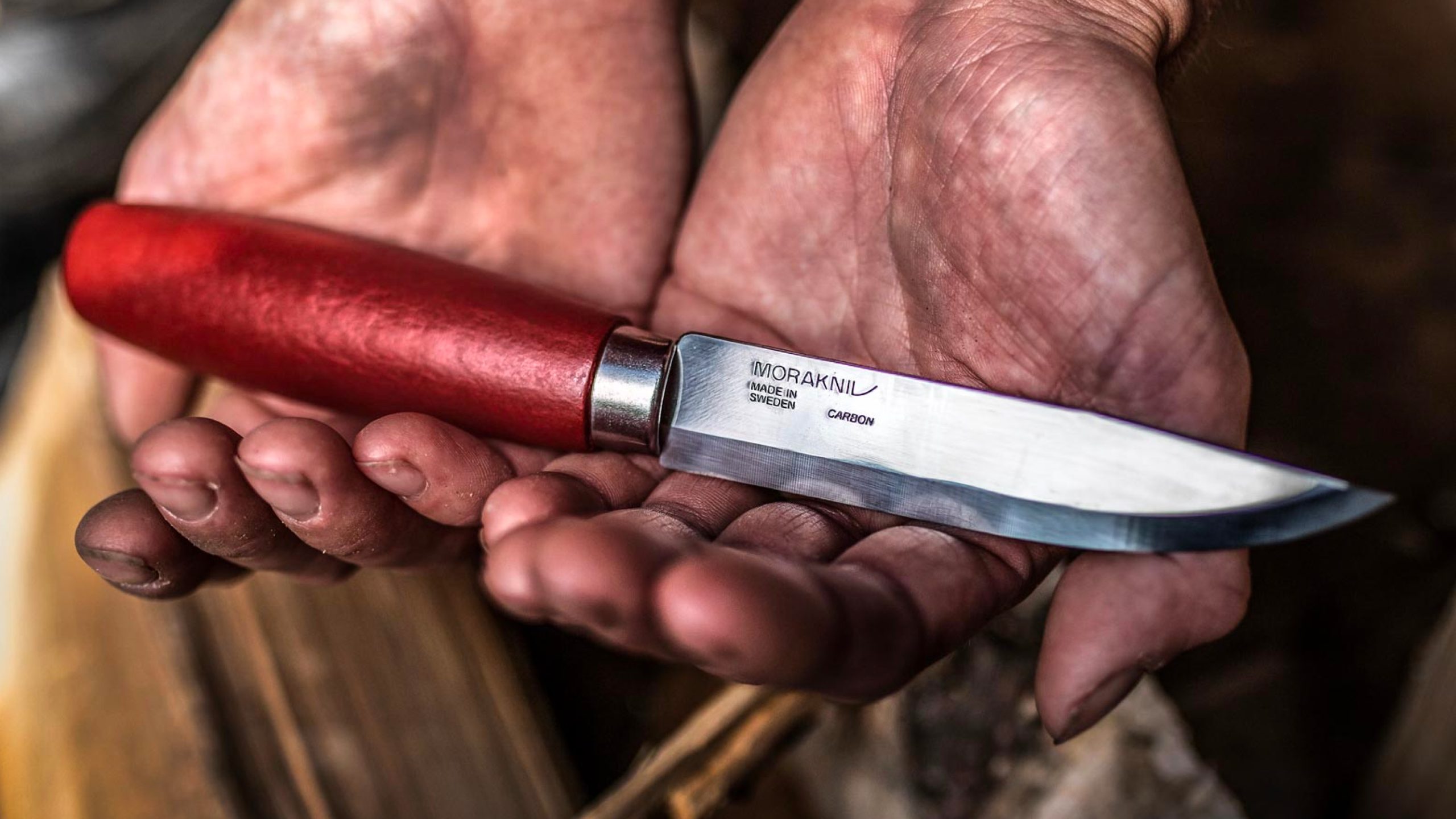
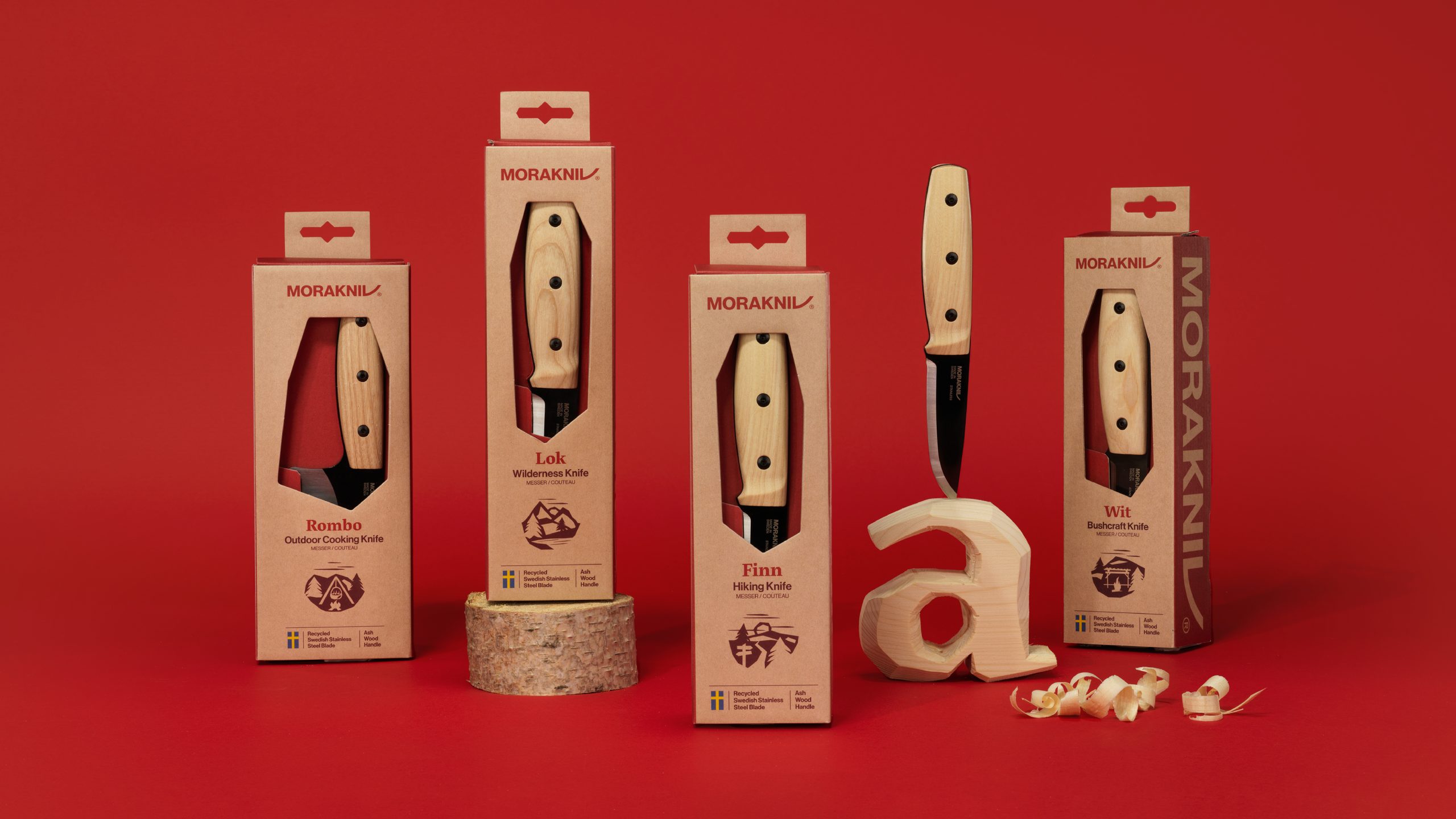
The new Morakniv is a handcarved brand, from the details in the typography through to the new packaging. Red is an important colour to Morakniv, as from the beginning their knife handles were stained in a special red colour which the brand is known for. The colour palette is based on the classic Mora Red, a red tone from the mines in Dalarna. Morakniv already had beautiful images of their products but they were missing an emotional layer to their imagery, so a new epic feel was brought in. Their new imagery also has red objects, clothing or lighting so it connects back to the brand. We wanted the typography to feel carved by a knife. The organic and sharp shapes of the typeface feel hand-carved. The counter shapes of the typeface also frame imagery and form the die-cut windows in the new recyclable packaging. The pattern is inspired by traditional folklore ribbons that originate from the village in Mora, where the company is based.
Overall, we felt that Morakniv had a great story to tell and we wanted it to shine through in every detail.
→ Article on Creative Review
→ Article on CAP&Design